Designing Wine Bottle Labels: An Expert Guide
The Dos and Don’ts of Wine Label Design
One of the first considerations in designing a wine label is to understand the brand identity deeply. The label should reflect the winery’s story and values, capturing the essence of what makes it unique. For instance, an established brand with a rich history might emphasize its heritage through traditional imagery, such as historic vineyards or family crests, and classic typography. On the other hand, a new brand might highlight its innovative approach or unique production methods with modern graphics and bold colors. Ensuring legibility is paramount; the text should be readable from a distance. Key information such as the wine type, vintage, and brand name should be easily discernible. An example of poor design would be using overly ornate fonts for all text, which can be difficult to read, especially in smaller sizes. Instead, reserve elaborate fonts for the brand name or specific elements and opt for clearer, more straightforward typography for essential information.

High-quality imagery is another critical element. Whether using illustrations, photography, or patterns, the images must be high-resolution and relevant to the wine’s character. For example, a label for a rustic red wine might feature intricate illustrations of grapevines, while a modern white wine could benefit from clean, minimalist photography of vineyards at dawn. The choice of bottle shape also plays a significant role in the design process. A well-designed label should complement the bottle’s shape and size, ensuring it fits well and enhances the overall appearance. An elongated bottle might suit a vertical label design, whereas a broad bottle might look better with a horizontal label. Using quality paper is crucial as well. The tactile feel of the label can significantly impact a customer’s perception of the wine. High-quality paper, such as textured or coated options, can add to the premium feel of the wine. For instance, a luxurious red wine could have a textured label that conveys sophistication, while a crisp white wine might use a smooth, coated paper for a modern, clean look.
Staying compliant with regulatory requirements is essential. This includes displaying the alcohol content, volume, origin, and any health warnings clearly. Failure to comply can lead to legal issues and a loss of consumer trust. On the flip side, overcrowding the label with too much information or overly complex designs can be overwhelming and detract from the wine’s appeal. Maintaining consistency in branding elements such as fonts, colors, and logos across all products is crucial for brand recognition. Ignoring this can lead to a fragmented brand image. Keeping an eye on trends is also important; while it’s essential to stay true to the brand, being aware of design trends can keep labels fresh and appealing. For instance, the current trend towards minimalist design can be incorporated subtly to modernize an established brand without losing its essence.
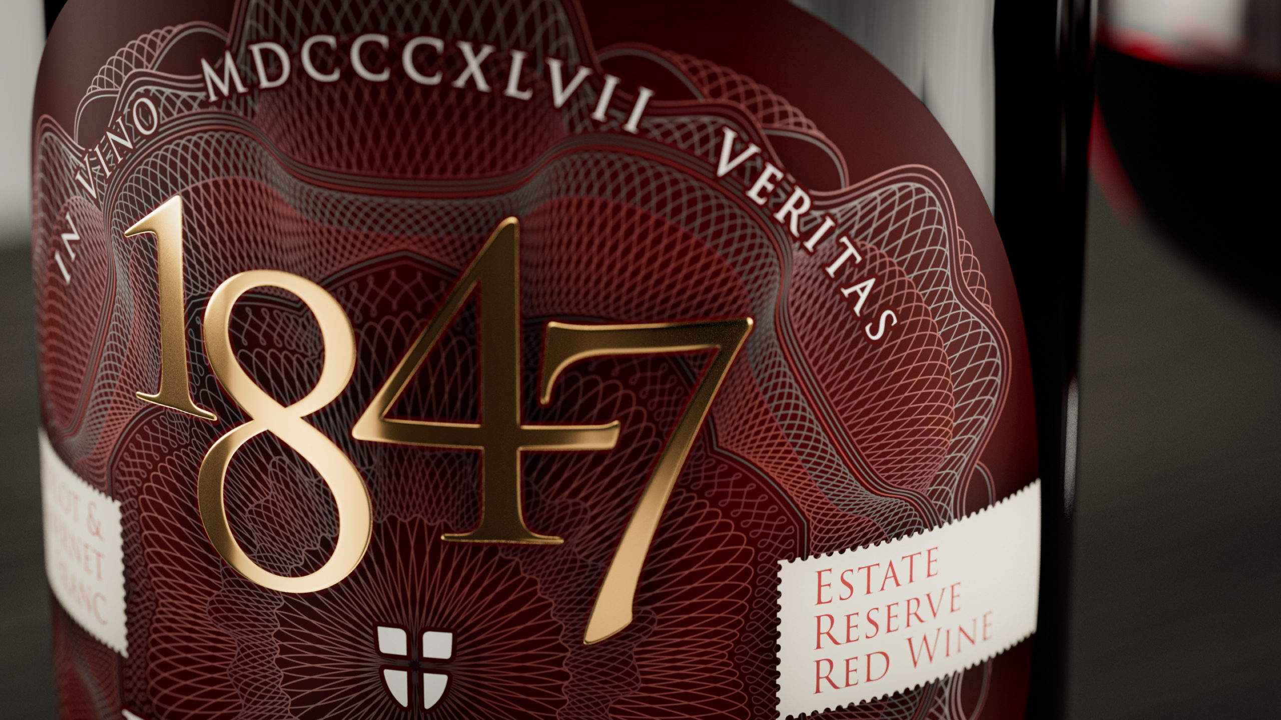
Investing in high-quality printing techniques is non-negotiable. Poor print quality can detract from even the best design. Techniques like embossing, foiling, and high-resolution digital printing can add a premium touch to the labels, making them stand out on the shelves.

Visual Language for Various Wines
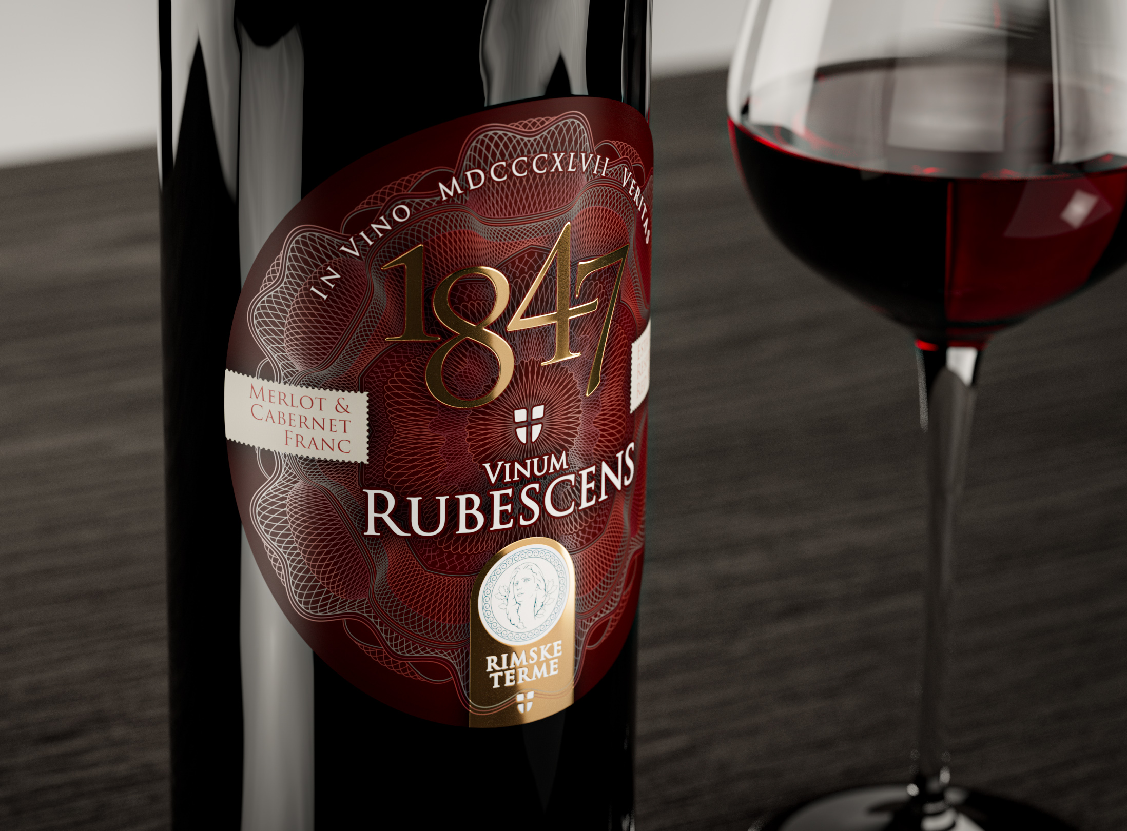
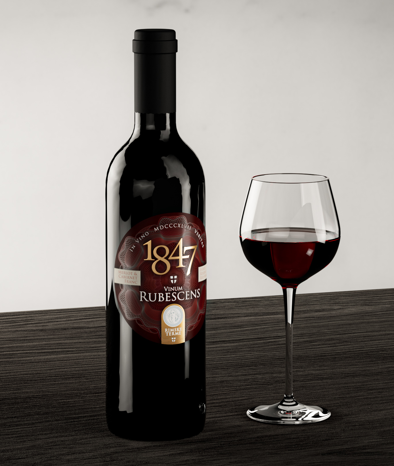
The visual language of a wine label should reflect the type of wine it represents. For red wines, deep reds, blacks, and golds are commonly used colors as they suggest richness and complexity. The imagery often includes traditional, sophisticated elements such as vines, grapes, and chateaux. Classic serif fonts like Garamond or Baskerville are typically used to evoke a sense of tradition and elegance. In contrast, white wines often use light, fresh colors such as whites, greens, and yellows. Clean, minimalistic designs featuring natural elements like flowers, fruits, or vineyards are common. Sans-serif or light serif fonts are preferred to convey freshness and modernity. For rosé wines, the visual language tends to be more romantic and playful. Pinks, light purples, and other pastel shades dominate the color palette. The imagery might include floral patterns or whimsical elements, and elegant, sometimes cursive fonts are used to suggest a lighter, more casual wine.
Differences Between Established Brands and New Brands
Established brands often have a traditional design language that reflects their heritage and quality. This might include elements like family crests, historic vineyards, and classic typography. They tend to maintain a consistent design language across all products to reinforce brand recognition. High-quality, textured papers and sophisticated printing techniques like embossing or foiling are commonly used to convey a sense of luxury and craftsmanship. On the other hand, new brands often take a more experimental and innovative approach to design. They might use bold colors, modern graphics, and unconventional typography to stand out. These brands are more flexible and willing to break from tradition, adopting contemporary design trends to appeal to a younger audience. They may also use unique materials or finishes to create a distinctive look, such as metallic papers or digital print effects.
Appropriate Typography for Wine Labels
The choice of typography can significantly impact the perception of the wine. For red wines, classic serif fonts like Garamond, Baskerville, or Times New Roman are often used. These fonts convey a sense of tradition and quality, appropriate for the rich, complex nature of red wines. For white wines, clean sans-serif fonts like Helvetica, Futura, or Gill Sans are preferred. These fonts are modern and easy to read, reflecting the fresh and crisp character of white wines. For rosé wines, elegant and sometimes decorative fonts like Didot, Bodoni, or cursive scripts are used. These fonts suggest a playful and romantic feel, aligning with the lighter, more casual nature of rosé wines.
Paper Used for Wine Bottle Labels
The choice of paper can significantly affect the perception of the wine. Textured papers add a tactile element and are often used for premium wines to convey luxury and craftsmanship. For instance, a high-end red wine might use a textured paper that feels substantial and sophisticated. Coated papers offer a smooth finish and can enhance color vibrancy, making them ideal for modern, clean designs. For example, a crisp white wine might use a coated paper that gives the label a sleek, polished look. Specialty papers, such as metallic, pearlescent, or translucent papers, can create unique visual effects. These are often used by innovative brands looking to stand out. Sustainable papers are increasingly popular, reflecting a commitment to sustainability and appealing to environmentally conscious consumers. A wine brand that emphasizes eco-friendliness might use recycled paper with a natural, earthy texture.
Contact
Let's create something amazing together
Agencija Klicaj, d.o.o.
Dolenja vas pri Polhovem Gradcu 22, 1355 Polhov Gradec
VAT: SI72363355
info@klicaj.si