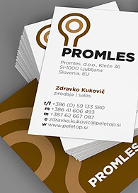
Ljubljana, July 18, 2012 – Energy saving and environment friendly prefabricated wooden houses are very popular at the moment, as they tend to be much nicer to the environment, and even your wallet, than ordinary brick houses. The competition on the market is therefore big and the companies that manufacture and sell such houses need to present themselves in the best way possible. This is why the company Promles asked us for a whole new visual identity that reflects the quality of their products. We also take care of the company’s brand personality and identity and help with media planning.
Promles used to sell and build prefabricated wooden houses of the company Promo, but now they expanded their activity and are selling also other types of prefabricated wooden houses, which are even more advanced, and they also offer a wide range of wood products and semi-products.
The basic symbol represents a tree and its annual rings, security, good ideas and growth. The basic color is brown, which is in further communication enriched with leaf green color. The basic typography is clean and clear – simple, Gotham.
In the next phase, our task will be to create a whole new web page, together with a completely new CMS.
